
Grade 8 | Lesson 4
Dean of Students: dean@theschools.com
Tech Services: tech@theschools.com
Grade 8 | Lesson 4
Dean of Students: dean@theschools.com
Tech Services: tech@theschools.com
Science
Lesson Overview
Using Graphs
SI for All?
You're a Scientist
![]()
Using Graphs
Often, it is helpful to be able to illustrate what happens during the course of an experiment, which can be done with a graph. A graph is a visual display of information or data. Graphs are useful for displaying information in business, sports, and many everyday situations. Different kinds of graphs: line, bar, and circle, are appropriate for displaying different types of information. It is important to use the correct kind of graph for the data you are presenting. Here is an examination of the three main types of graphs.
Line
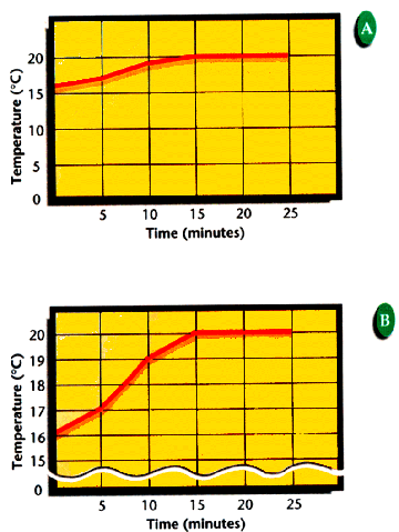
Line graphs are used to show trends or how the data change over time. In graph A below, each temperature interval represents 5°C. Because the temperatures were between 16°C and 20°C, the lower portion is not even used. In graph B, the breaks are between 0 and 15 which means the numbers in this range have been left out to save space. Each temperature mark represents 1°C. The temperature range graphed covers about 5 degrees instead of the 20 degrees covered in the top graph. Both represent the exact same changes in temperature.
Bar
A bar graph is useful for comparing information collected by counting.
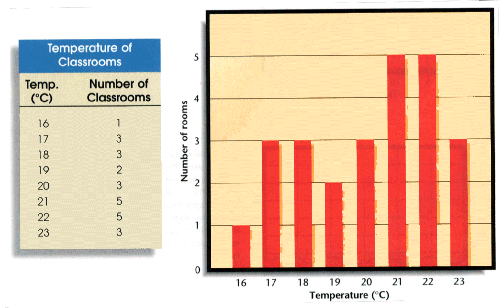
The height of each bar corresponds to the number of rooms at a particular temperature. What is the temperature of your at-home classroom? In a line graph, adjacent points are related with a straight or curving line. In a bar graph, the bars are not connected.
Circle
A circle graph, or pie graph, is used to show how some fixed quantity is broken down into parts. The circular pie represents the total. The slices represent the parts and usually are represented as percentages of the total.
The graph below shows the percent of buildings in a neighborhood using each of a variety of heating fuels. You can easily see that more buildings use gas heat than any other kind of system.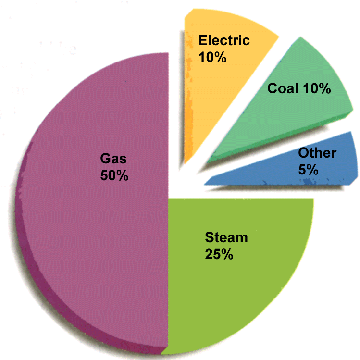
![]()
SI for All?
Can you think of any situations, other than in science classes, where you see SI units in use? Athletes compete on courses that are measured in meters, medicine is sold in milligrams and milliliters, and some soft drinks are sold in 2-L bottles. Imported equipment is manufactured to metric specifications. However, in the United States, other units of measure are still common. Carpenters still buy lumber measured in feet and inches, farmers measure their land in acres and their crops in bushels, fabric is sold by the yard, and highway signs give distances in miles and speed limits in miles per hour. Sometimes both systems are used.
For nearly 100 years, advocates of the metric system and the newer SI units have argued for widespread adoption of the system in the United States. Only a few countries in the world have not adopted SI as the official system of measurement. But opponents to changing the measurement system have argued just as vigorously against it.
Write a one-paragraph essay summarizing your position on the adoption of SI units in the United States.
Research It!
Suppose that on the first day of the new year, the whole United States is to begin using only SI units. What changes would need to be made by that time. For who would the change be most difficult and costly? Who would benefit most from this change?
![]()
You're a Scientist
In this you're a scientist, you'll undertake a simple experiment that will give you the opportunity to develop a graph from data you've collected yourself.